

The Laboratory for Bio-Micro Devices at Brigham and Women’s Hospital (https://jonaslab.bwh.harvard.edu) develops drug releasing implantable intratumoral microdevices (IMD) [1]. Using MIKAIA®, they want to examine in a quantitative fashion how the cell subpopulations change in the vicinity of the drug-releasing IMD.
This app note presents two possible approaches
- Option a) Proximity Analysis App. It computes, per cell, the distance to a target.
- Option b) Concentric margins. Assign cells into concentric margins of fixed diameters.
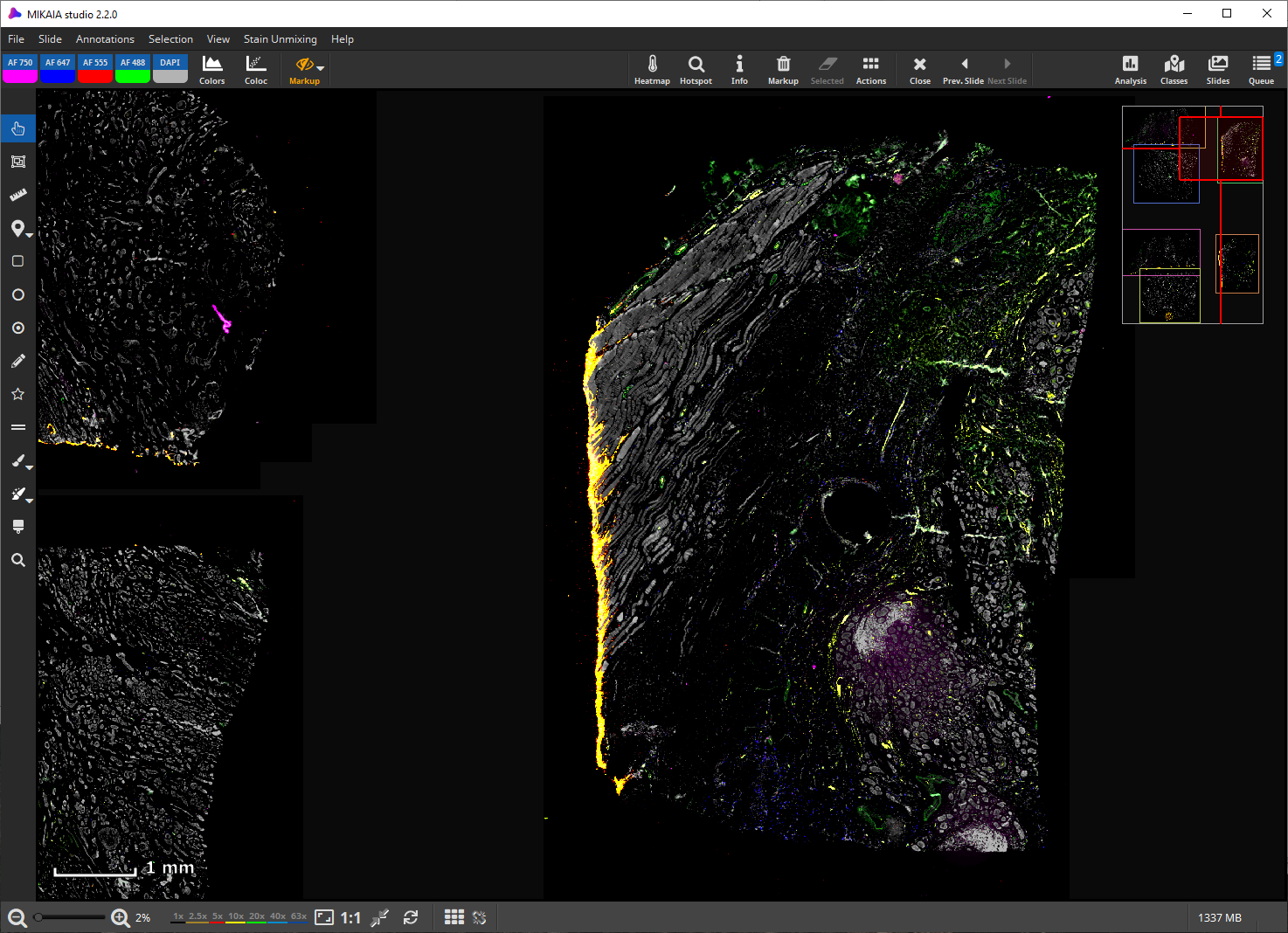
The following screenshot shows a fluorescent scan of the resected tumor tissue. The hole where the IMD was located is clearly visible in the center of the tissue.
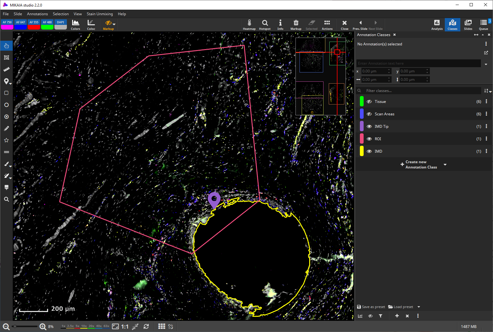
Using the magic brush, we first annotate the IMD location (yellow). We then mark the IMD’s drug dispensing tip (violet marker) with the marker tool and finally annotate the region of interest (red) with the pen tool.
Option a) Proximity Analysis App
In this option, we first run the FL Cell Analysis App to detect and phenotype cells. In this example, we provided no cell naming scheme (lineage map), and so default names are used. The following screenshot shows cells annotated by their co-expression profile, i.e., one annotation class per encountered combination of expressed cell markers is created.
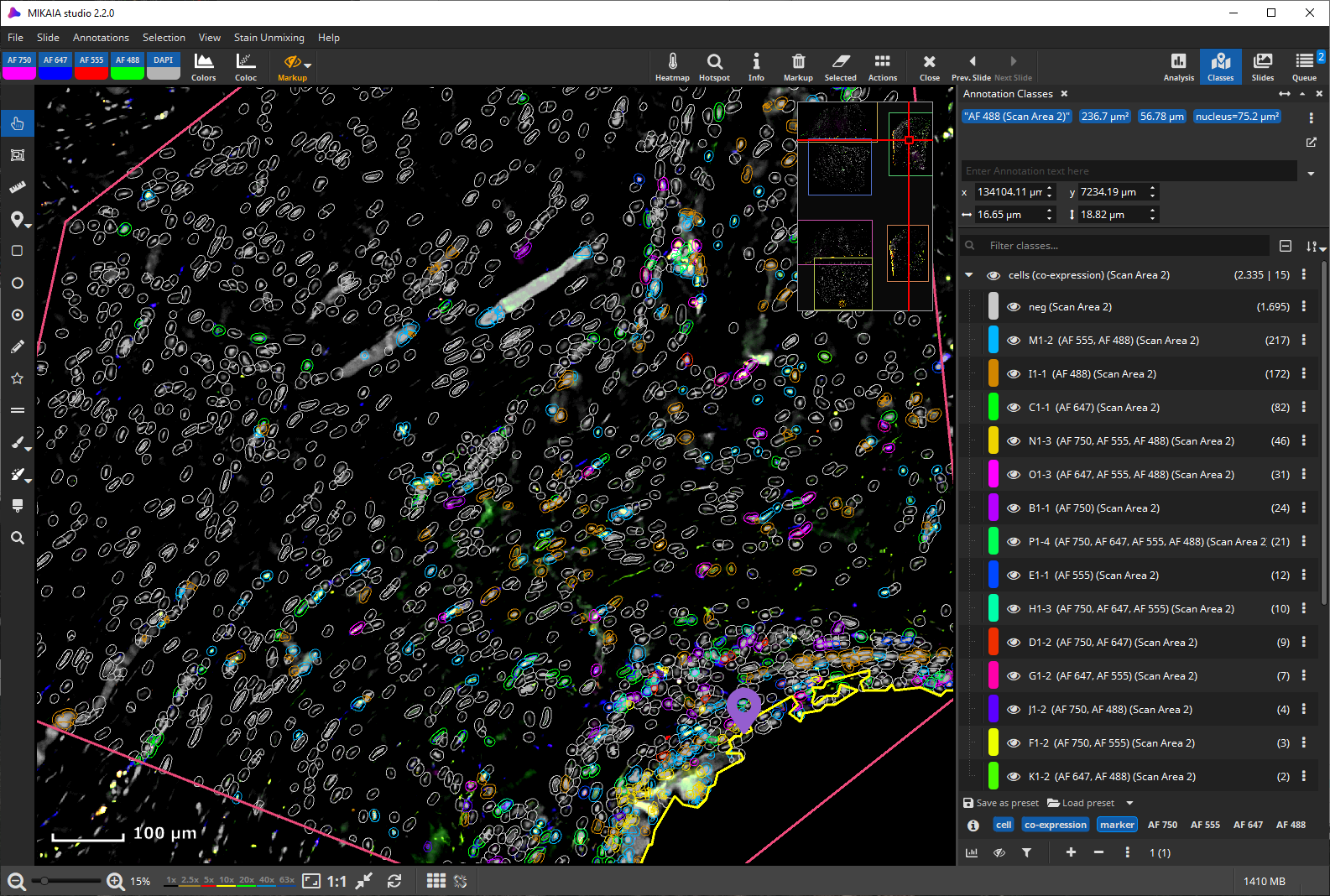
This screenshot shows only the cells found positive for the green Alexa Fluor 488 dye. (The scan does not contain the metadata which antigens were targeted, but only the dye names.)

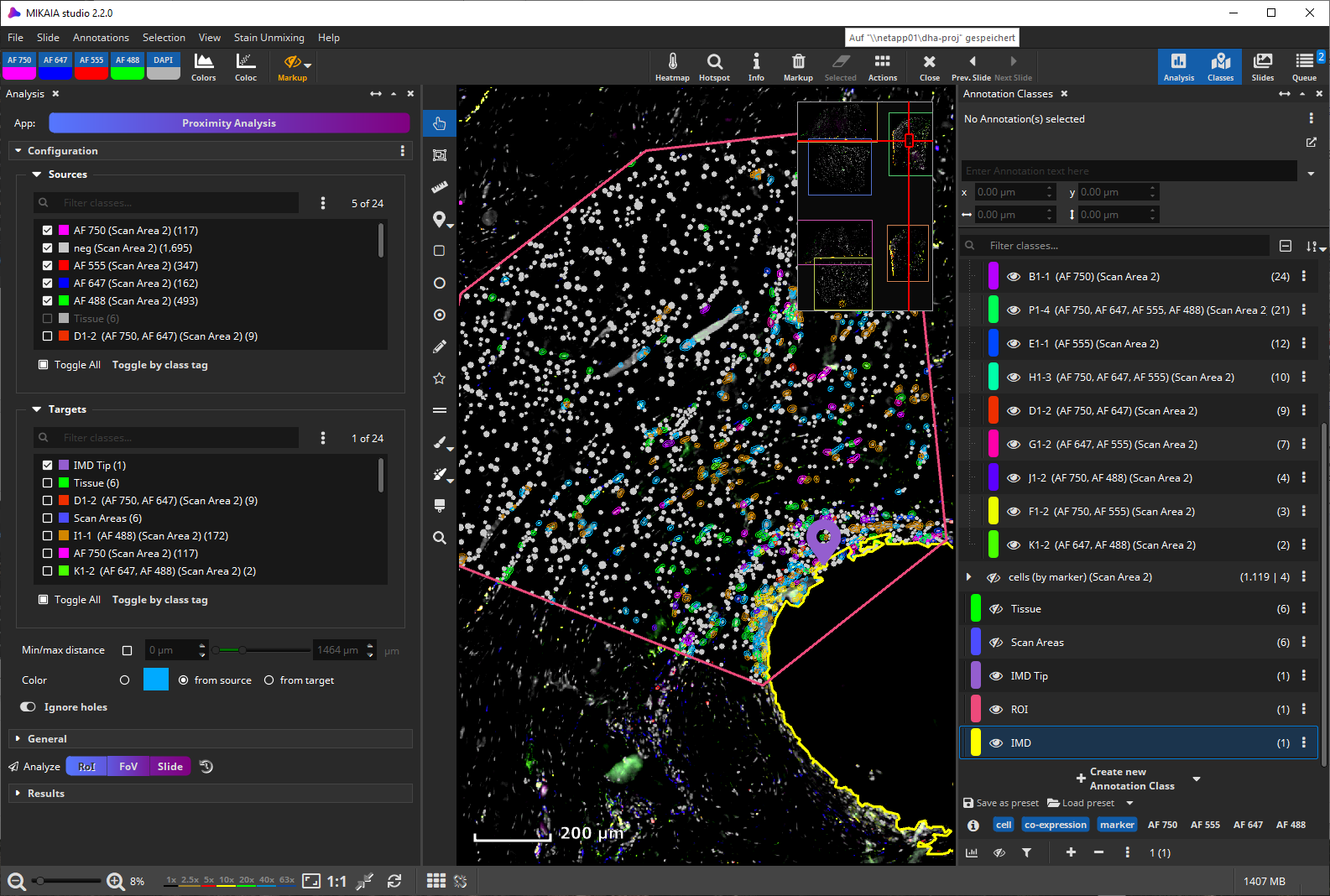
Next, the Proximity Analysis App will be used to quantify distances of cells to our target point, the IMD’s tip. As source classes (“sources” list, top), here, the individual marker annotation classes are selected. Alternatively, the set of co-expression classes could also be selected to obtain distances per co-expression phenotype.
The analysis can be started by zooming out so that the entire ROI is visible and then clicking the analyze-“FoV” button or by selecting the red “ROI” annotation and then clicking the analyze-“RoI” button.
The analysis only takes a few seconds. The distance for each annotation in any of the selected source classes to the closest annotation in any of the selected target annotation classes is computed.
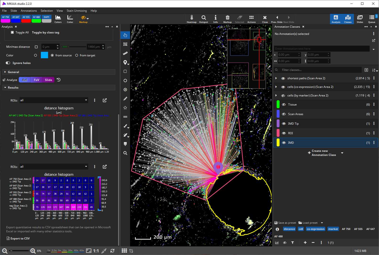
In this example, the violet “IMD Tip” marker annotation was selected as a target. Alternatively, the yellow “IMD” path annotation could have been selected, in which case the shortest path to any point on the target annotation is sought.
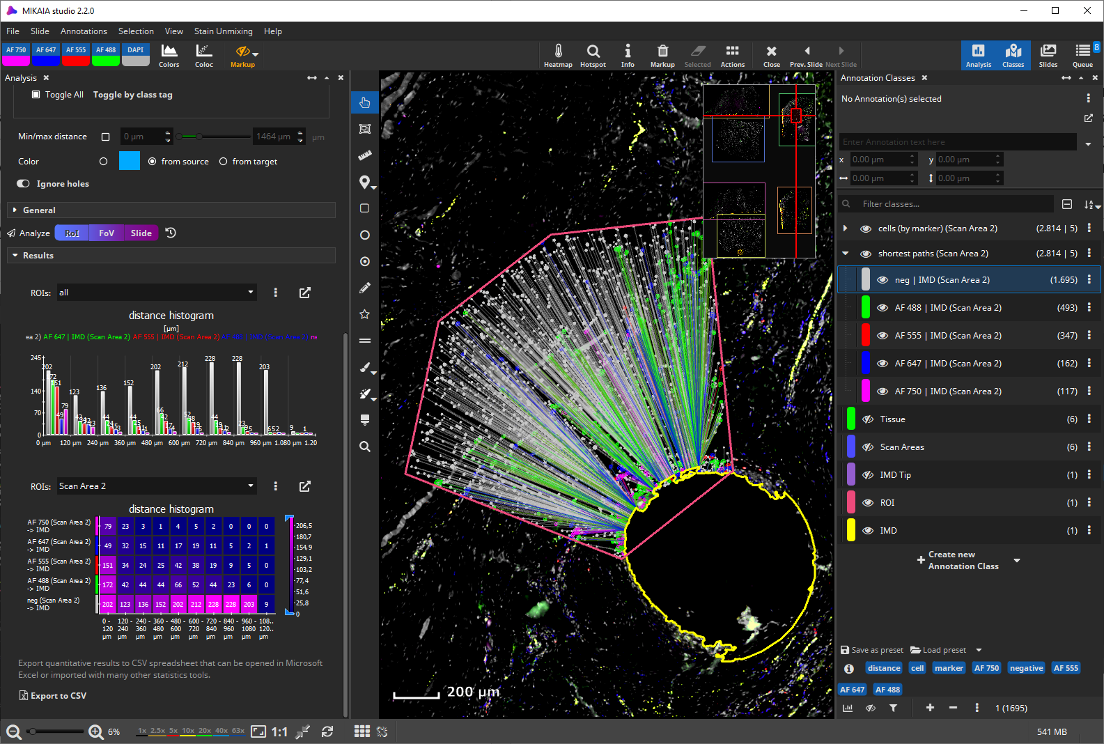
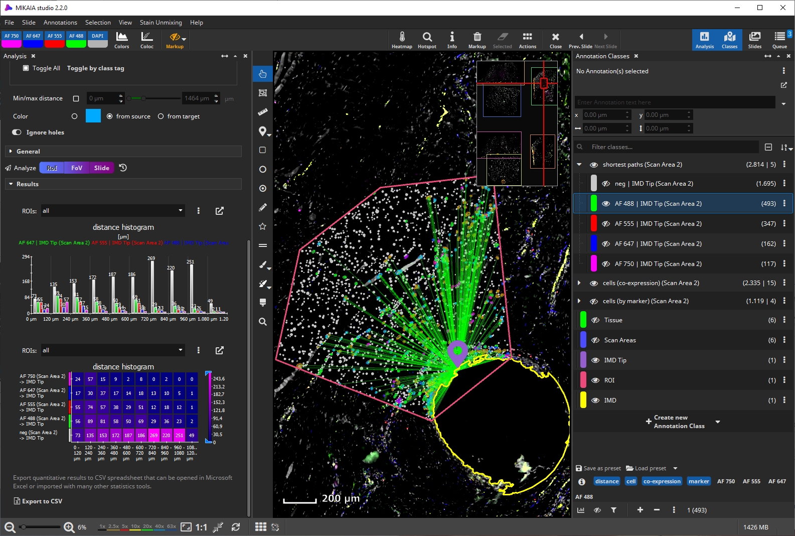
Since, in this example, we examined the distances per marker, we should view the “shortest path” classes one at a time, since the same cell could be positive for more than one marker and thus may have yielded multiple marker annotations. This screenshot shows the paths only for the AF488+ cells.
The diagrams on the bottom left can be undocked and enlarged. They show the absolute abundances by cell type and by distance to the target (histogram with 10 bins). Further diagrams can easily be generated by clicking the “Export to CSV” button and opening the exported file in Microsoft Excel or importing it into Python, Matlab, or R. This spreadsheet includes the statistics presented in the UI as well as a row per cell.
Option b) Concentric margins
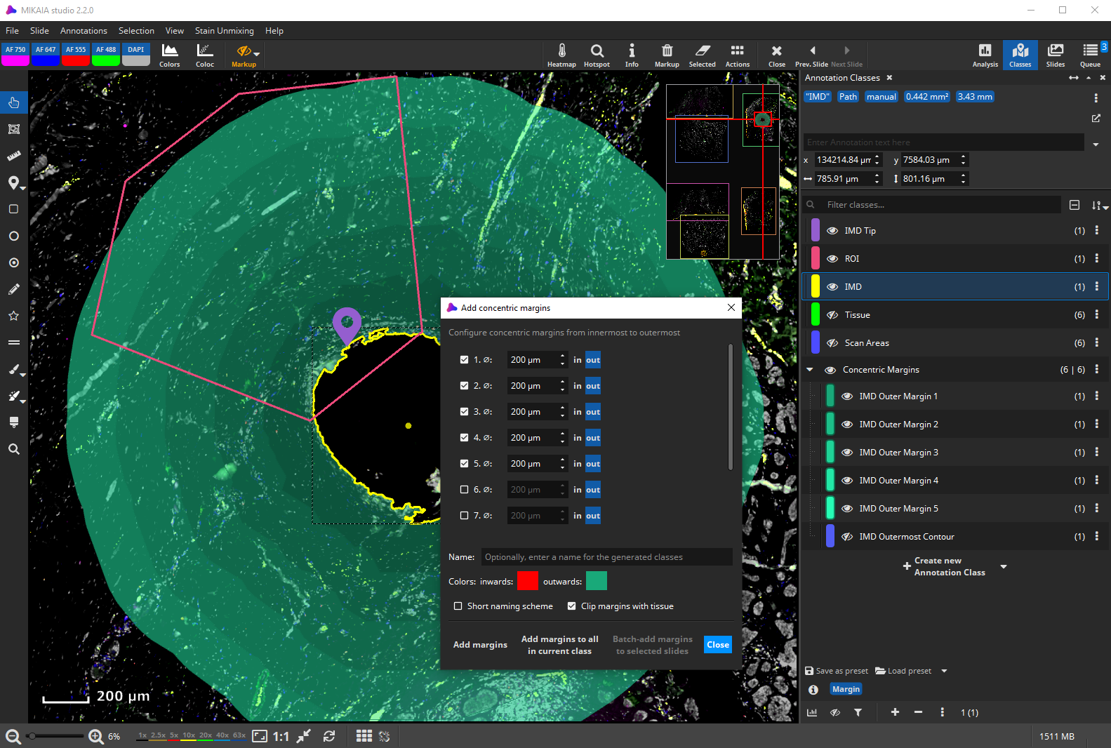
A similar alternative approach is to add concentric margins to the yellow IMD annotation. The “Add margins …” dialog can be opened via the main toolbar’s “Actions” menu.
Here, we create five margins with a diameter of 200 µm each.
Next, we can clip the margins with our red ROI annotation. To do that, click “Clip annotations …” in the main toolbar’s “Actions” menu. Select the green margin annotations as subjects by first multi-selecting them in the viewer (click on them while pressing CTRL key) and then clicking the “take from viewer” button in the dialog. Next, select the red “ROI” annotation as the “Clip annotation” in the analog way. Click “Clip”.
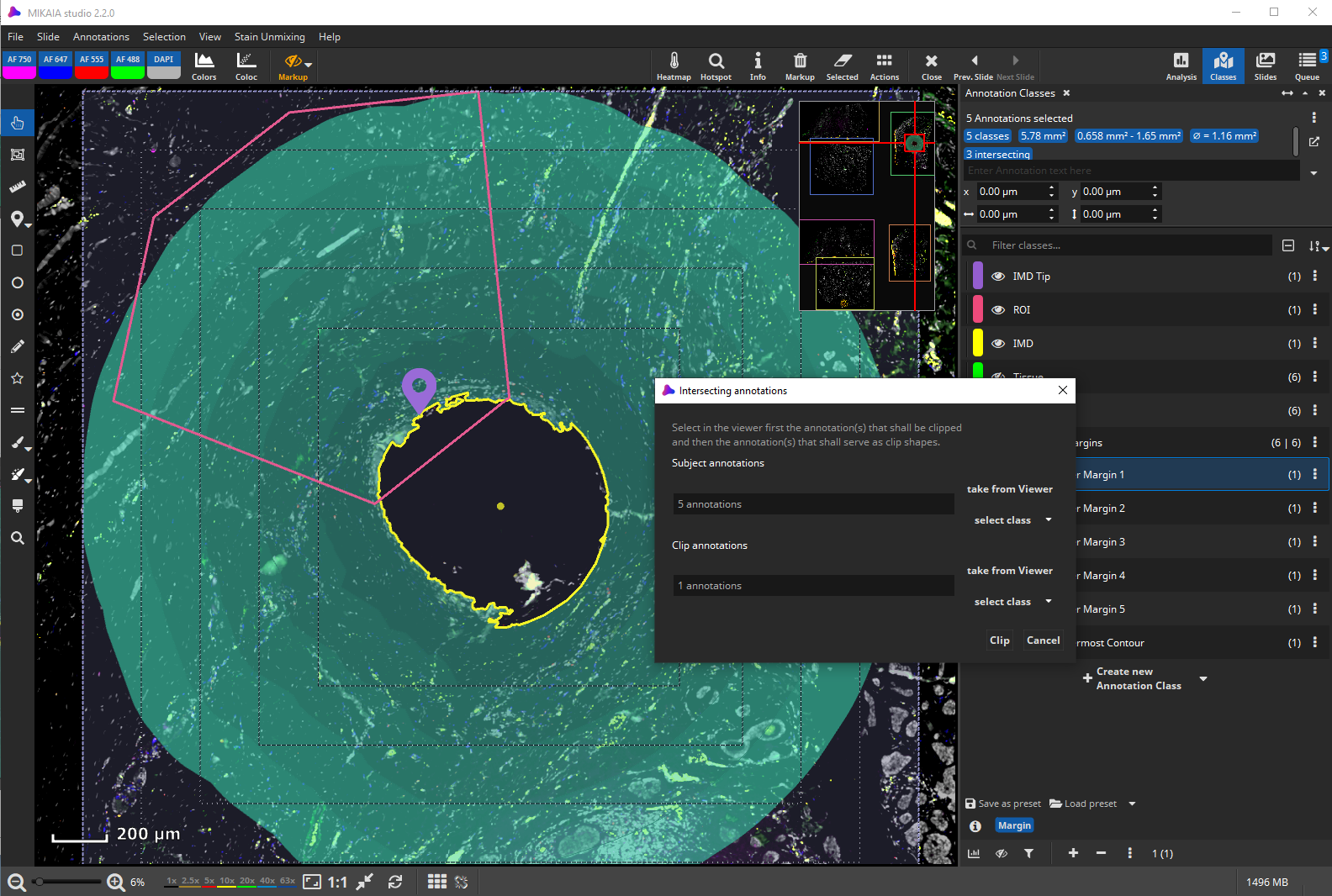

The margins are now clipped to the ROI. Just in case, the original unclipped margin annotations still exist, but have been moved into the “Backup” group and hidden.
Now, the FL Cell Analysis App is used to detect and phenotype cells in the ROI. In the app’s configuration panel’s “Divide by ROIs” section, select the 5 margins classes. This way, the app will group all detected cells by the ROI in which they are contained.
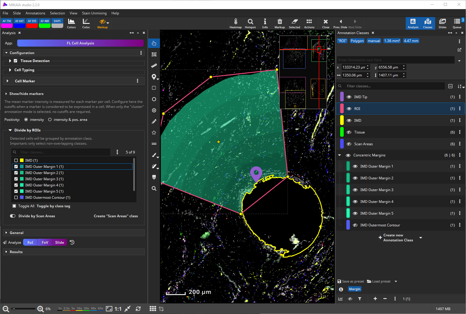
As before, the FL Cell Analysis App has identified the same set of cells in the red ROI annotation, but now grouped them into individual annotation classes. In the screenshot, only the negative (i.e., not positive for any of the four markers) cells in margin #4 are shown.
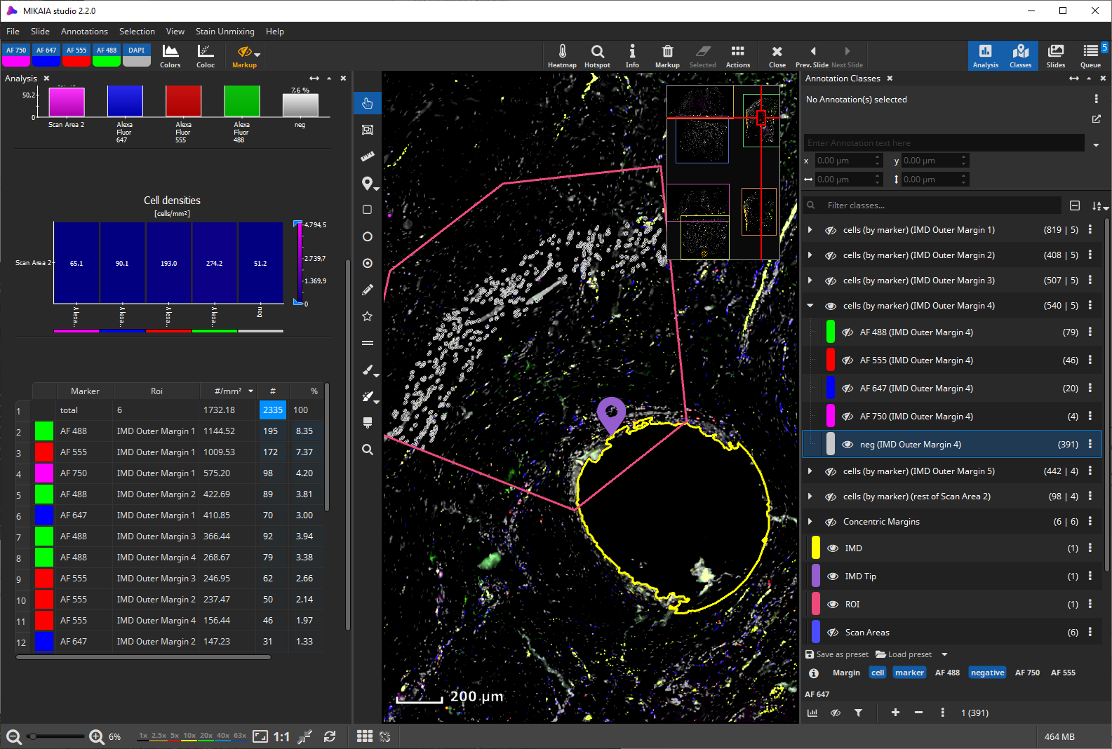
The results table on the bottom left lists the abundances and cell densities (cells per mm²) per margin. In the below screenshot, only cells in the 4th margin that are not positive for any of the four markers are shown, all other cell classes are hidden.
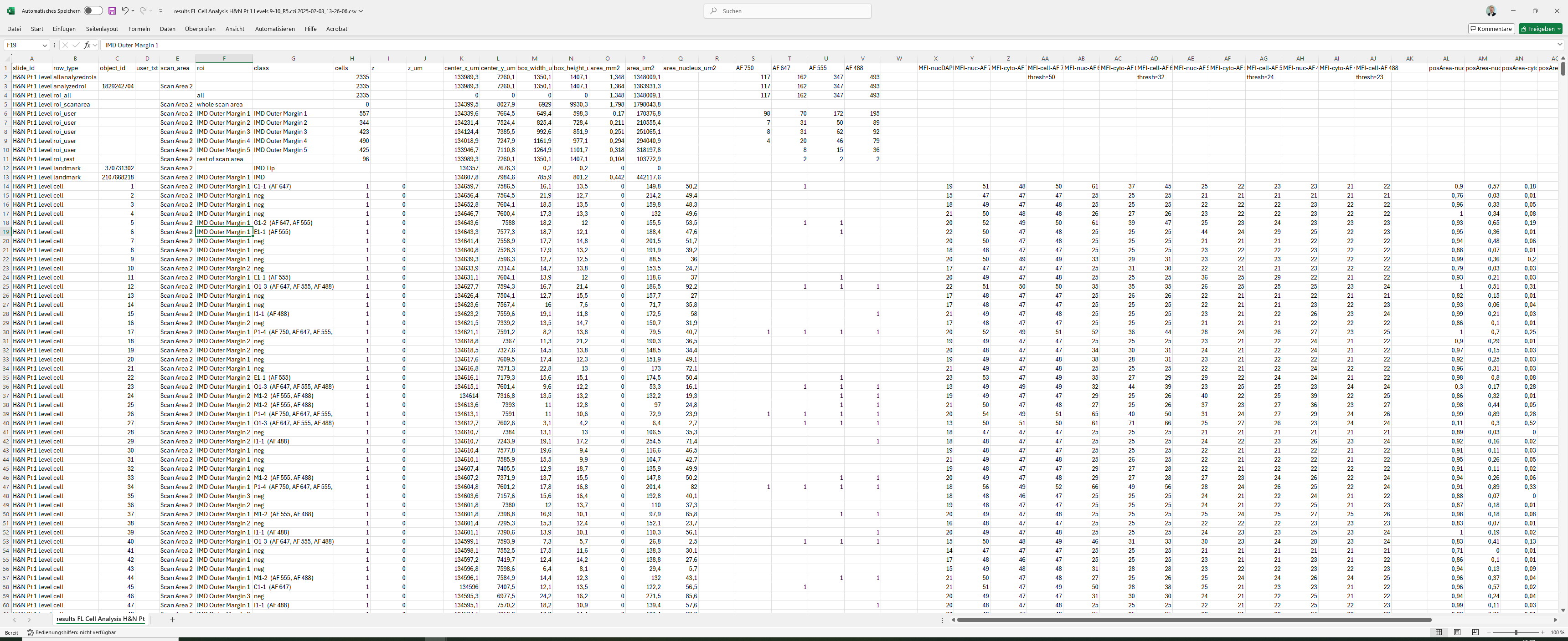
As will all MIKAIA® analyses, quantitative results, including information on each individual cell, can be readily exported by clicking the “Export to CSV” button. Here is a (low-magnification) screenshot of the exported spreadsheet to illustrate how all numbers are organized in a column oriented fashion that can be easily processed by Microsoft Excel, Python, Matlab, or R.
References
- [1] Peruzzi P, Dominas C, Fell G, Bernstock JD, Blitz S, Mazzetti D, Zdioruk M, Dawood HY, Triggs DV, Ahn SW, Bhagavatula SK, Davidson SM, Tatarova Z, Pannell M, Truman K, Ball A, Gold MP, Pister V, Fraenkel E, Chiocca EA, Ligon KL, Wen PY, Jonas O. Intratumoral drug-releasing microdevices allow in situ high-throughput pharmaco phenotyping in patients with gliomas. Sci Transl Med. 2023 Sep 6;15(712):eadi0069. doi: 10.1126/scitranslmed.adi0069. Epub 2023 Sep 6. PMID: 37672566; PMCID: PMC10754230.


Add comment