
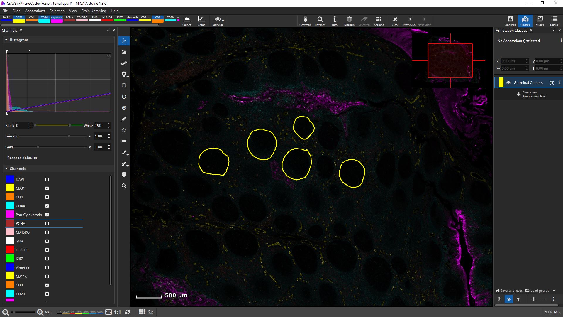
MIKAIA University Application Note: Analyzing multiplexed immuno fluorescent (mIF) slides
MIKAIA has good support for viewing, annotating and analyzing multi-plexed (aka high-plex, aka hyper-plex) whole-slide images generated by instruments from various vendors such as:
- Akoya Biosciences QPTIFF, e.g. PhenoCycler™ (formerly CODEX®), PhenoImager Fusion
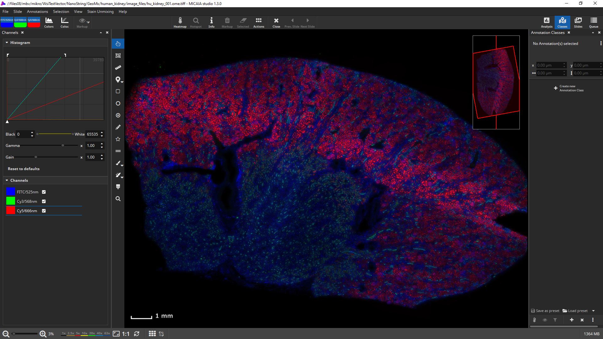
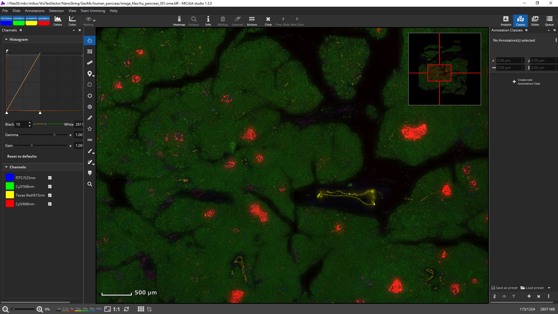
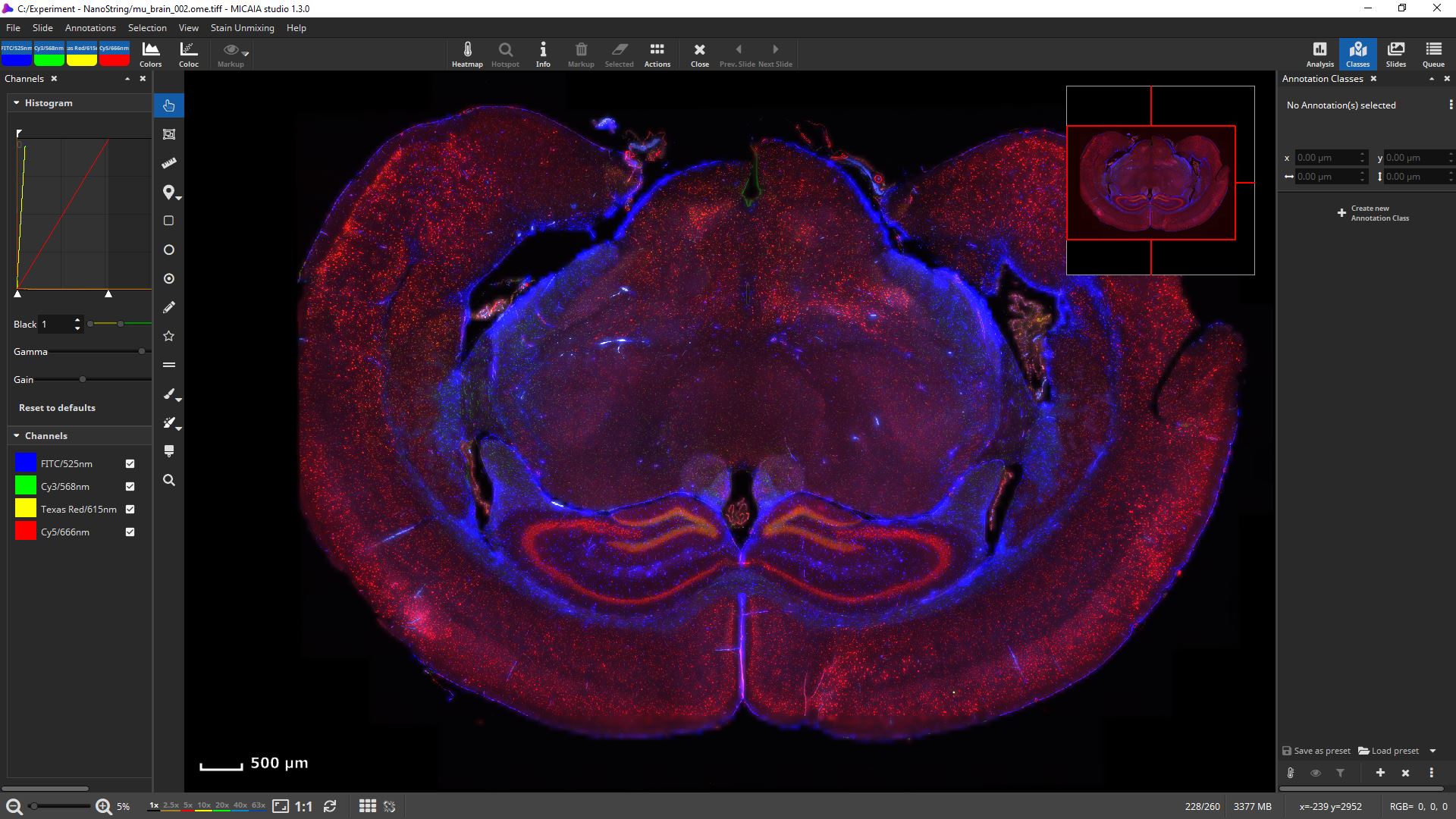
- NanoString OME-TIFF, e.g., GeoMx DSP
- Lunaphore Comet™ OME-TIFF,
- Zeiss CZI, e.g. AxioScan, AxioImager, …
- Hamamatsu NDPIS, e.g., NanoZoomer S60
- Olympus VSI, e.g., VS200 scanner
- Leica Aperio SVS
- Motic QPTIFF, from their new FL scanner
- any other that produces OME-TIFF.
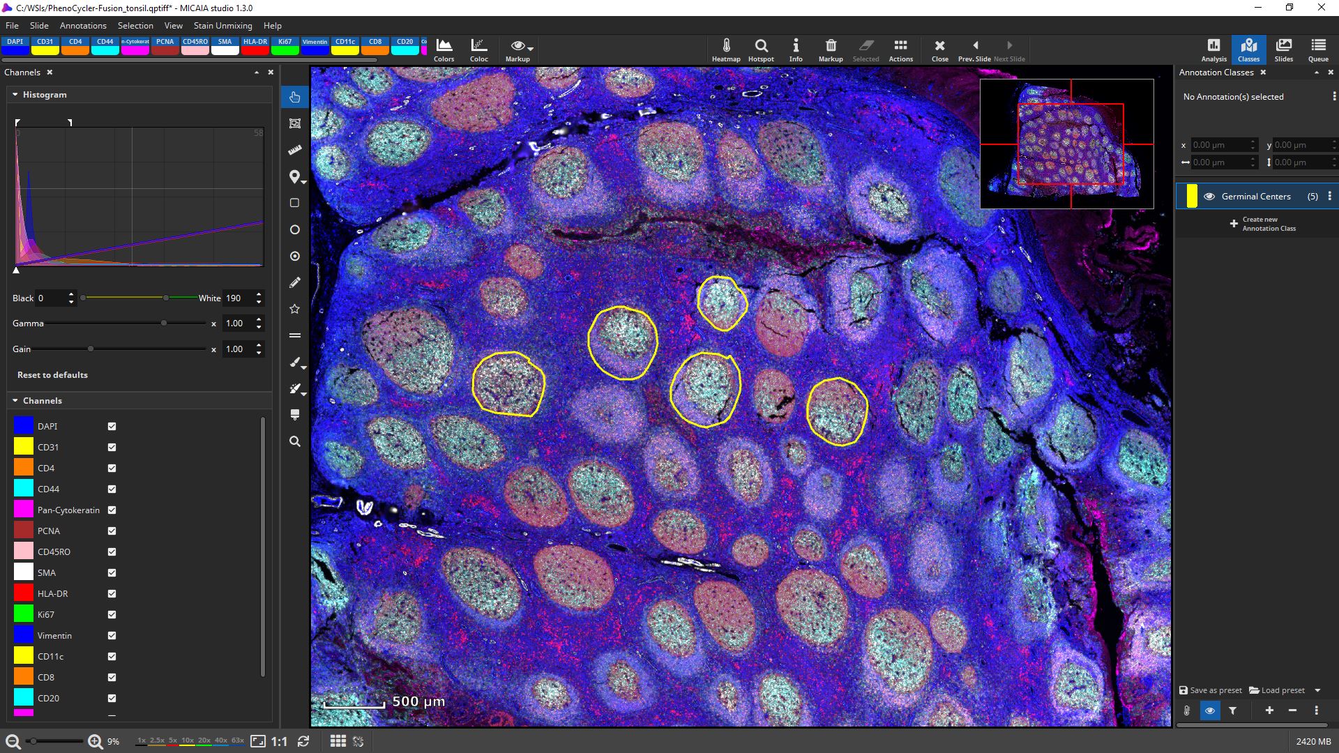
mIF scans can be rendered with 16 bit fidelity.
Channels can be individually toggled on and off.
Their black and white levels, gamma, gain, and pseudo color can be individually changed.
Get first insights within seconds:
Cross-channel correlation analysis
Before diving into a cell-by-cell analysis, you may choose to start with a marker-pair-wise coexpression analysis that is computed from the entire slide at a proxy resolution. Open the “Colocalization” panel from the “Coloc” button in the main toolbar right next to the fluorescence channel buttons. It will compute the correlation between any two fluorescence channels using the Pearson Correlation Coefficient, (“PCC”, ranges from -1 to 1, higher absolute value indicates higher correlation) and display them in a channel-wise confusion matrix.
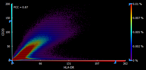
Each such combination is additionally visualized using an interactive scatter plot. The channel combinations are automatically sorted by descending correlation, facilitating fast inspection of the top N correlating combinations. Since the correlation is computed per pixel on a downscaled proxy of the whole-slide and does not involve segmentation of cells, this information is available within seconds.
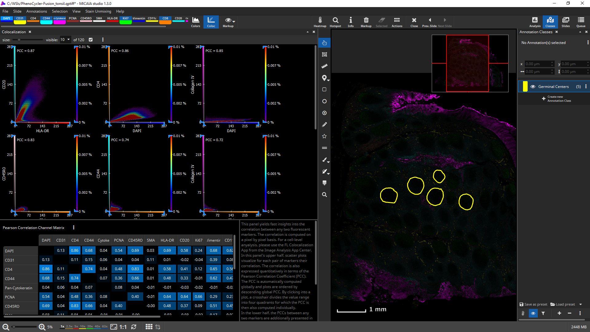
A single scatter plot allows defining quadrants or even a custom rectangular value range and will compute the correlation of each such value range. The axes can be interactively constrained and the heatmap sensitivity adjusted.
Cell-based colocalization analysis
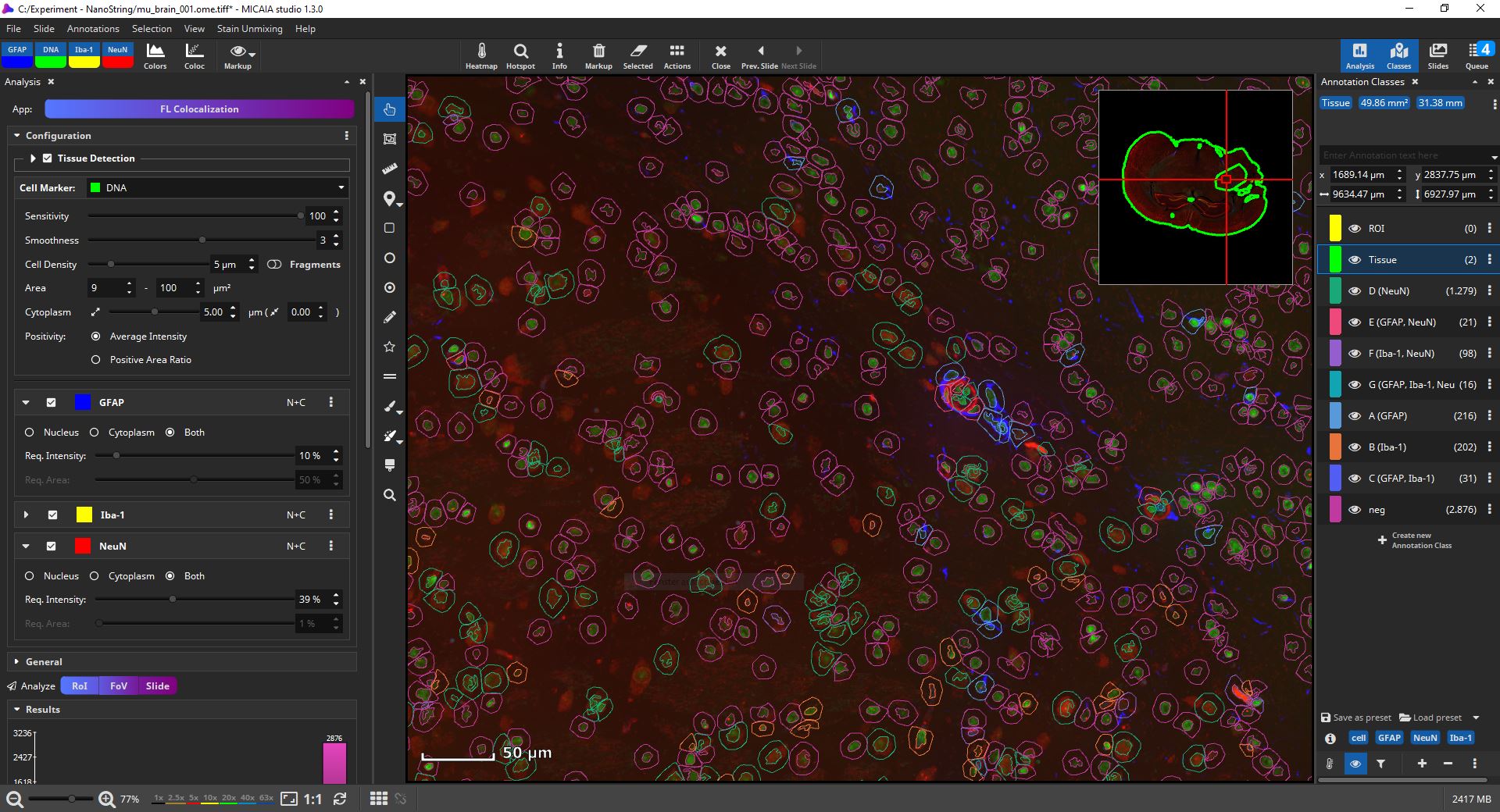
For a cell-based colocalization analysis, open the app center, and select the FL Colocalization App. In the app configuration pane, select first which fluorescent channel marks all cells, e.g., typically the DAPI marker (in the below screenshot it is the “DNA” channel). This channel is then analyzed first and cells (nuclei) are identified. Each detected nucleus is then dilated by a user-defined margin (e.g., 5 µm), since the cell marker channel typically represents the nucleus and the remaining markers may includes ones that are expressed only in a cell’s cytoplasm or membrane. MIKAIA will then compute the mean fluorescence intensity (MFI) for each cell per marker separately in the nucleus and cytoplasm.
The user selects manually per marker which signal level (MFI) is considered positive, because sometimes a weak signal does not mean the marker is really expressed. Additionally, this evaluation (“MFI exceeds threshold?”) can be configured to be carried out only in the nucleus (“N”), only in the cytoplasm (“C”) or in both compartments of the cell (“N+C”). As an optional 2nd constraint, you can require that also a certain ratio of this area exceeds the threshold. This is useful when you want to require that a certain signal level is expressed throughout the entire nucleus or cytoplasm.
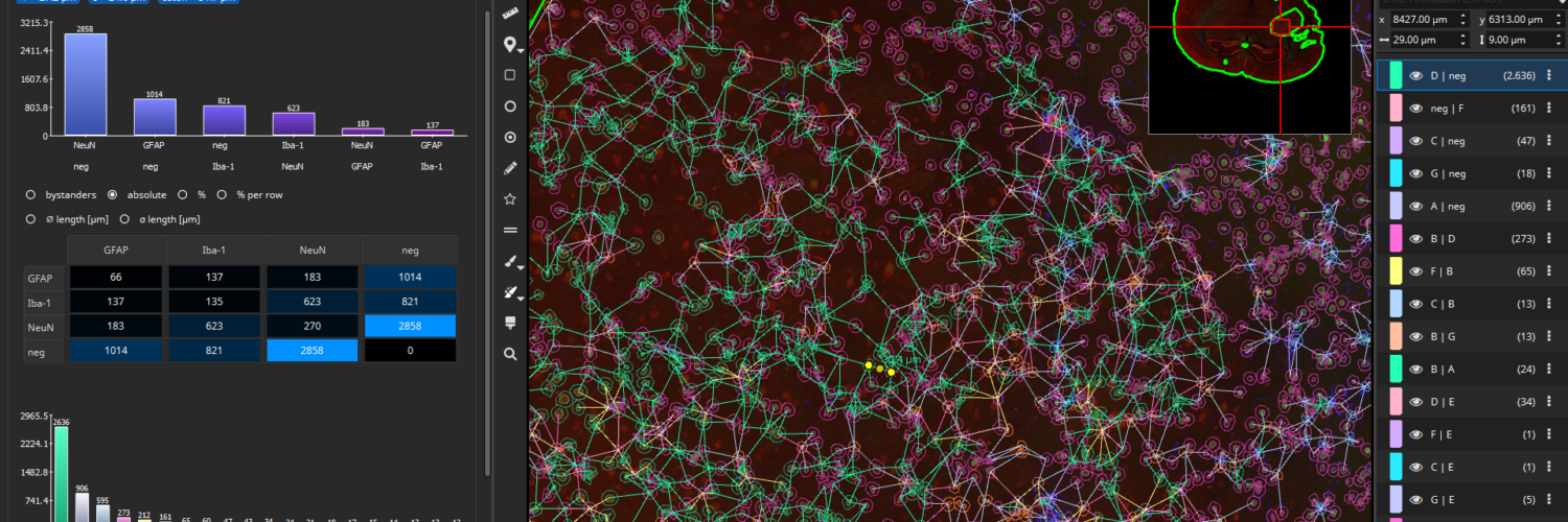
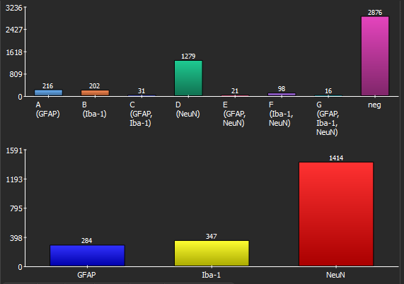
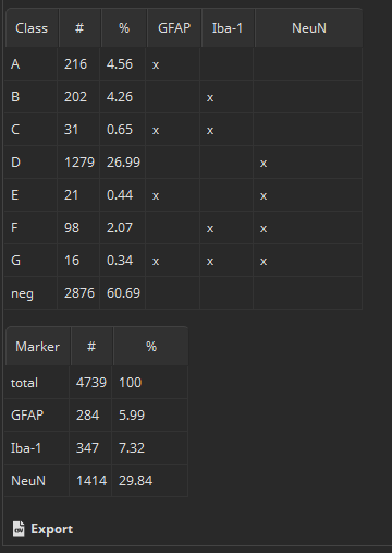
Bottom line, MIKAIA collects for each cell the MFIs per marker separately for the nucleus and cytoplasm. Based on the thresholds you configured, it will then decide per cell which markers are expressed. Each encountered marker combination is represented by an annotation class, e.g., in the below screenshot class “E (GFAP, NeuN)” contains all cells where “GFAP” and “NeuN” are expressed, but the remaining marker “Iba-1” is not. Since some combinations may not exist, the classes are not strictly alphabetic (“A,B,C..”), but some letters may be missing.
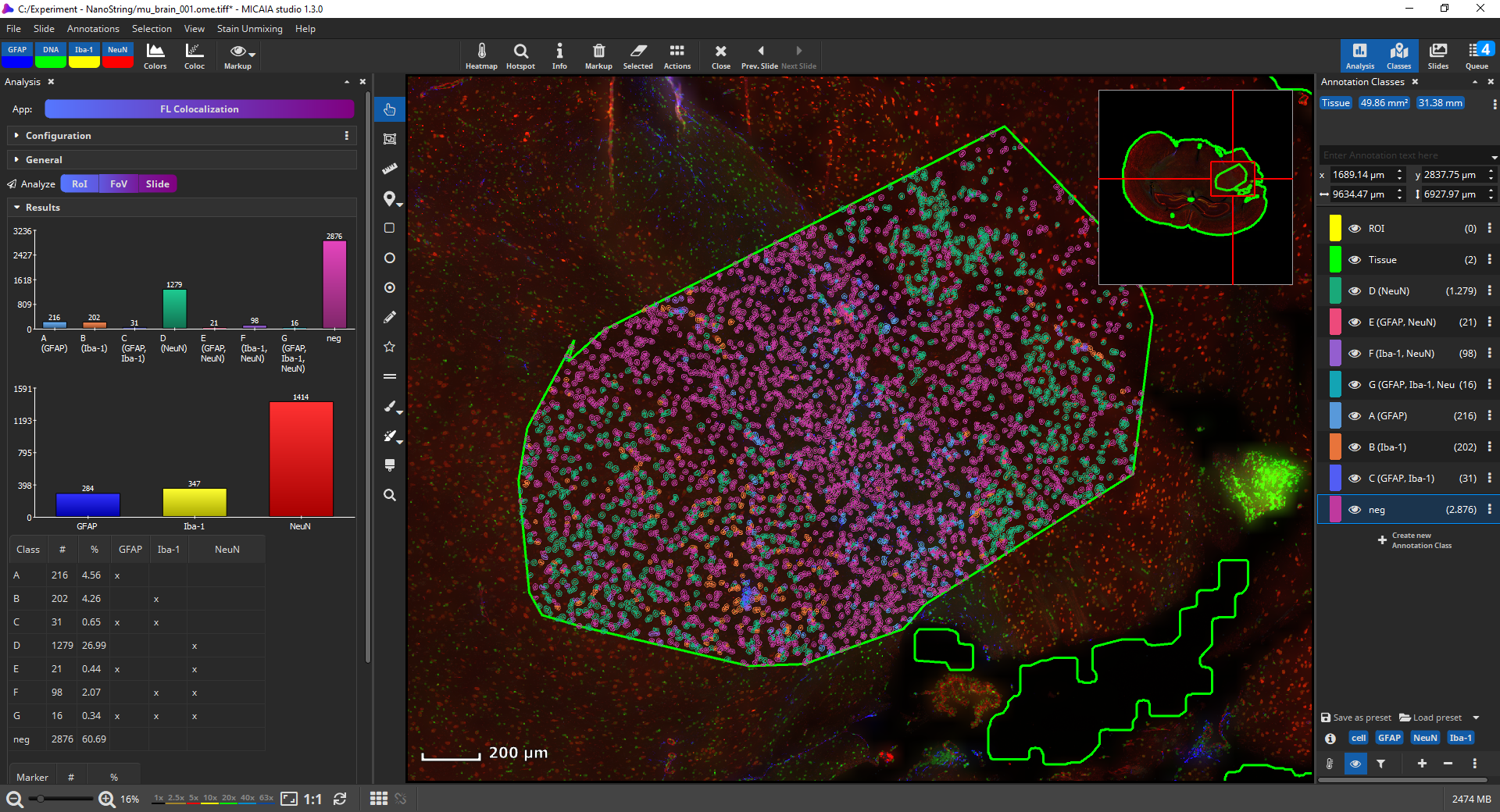
Now, the amount, location, and density (in #/µm2) is known. Individual cell classes as well as the whole-slide-image channels can be hidden or shown. Additionally, generated annotation classes (one per encountered marker combination) are “tagged” with marker-tags such as “GFAP” or “NeuN” in this example. By clicking on a blue tag button, all classes that include this marker are toggled on/off. The markup appearances can be configured individually per class, e.g., the outline and fill color can be changed. Also, all classes’ appearances can be globally changed via the “Markup” button in the main toolbar. It allows to force outlined or filled cell annotations and the markup’s opacity can be changed.
The “Results” pane shows two bar diagrams of the absolute amounts of cells by (1) marker combinations and (2) marker as well two tables containing the same absolute and additionally the relative counts. By clicking “Export” these values plus many more values, in summary but additinoally per cell can be easily exported into a CSV file that can be opened by Microsoft Excel or imported into R or Matlab for further statistical processing.
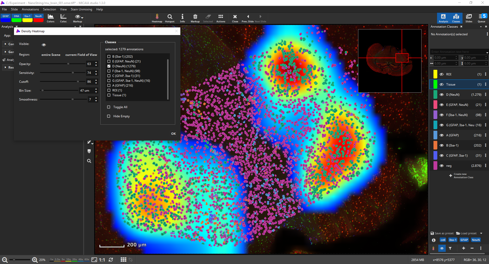
Density Heatmap
You could also use the density heatmap function available via the “Heatmap” button in the main toolbar to add a heatmap layer. In the dialog, you can select which cell classes should be considered by the density heatmap. Areas with a higher density of these cells will then be indicated by a warmer color. The heatmap’s internal 2D bin size, sensitivity and cutoff, smoothness, and opacity can be interactively configured.
Cell-cell-interactions
In a next step, it may be worthwhile to gain insights on possible interactions between cell types. The Cell-Cell Connections App interprets cells as nodes in a graph and connects each cell with its nearest neighbors. A connection (edge) between a cell of type A with a cell of type B is denoted an A-B connection. Each occurring combination is again visualized as a markup class in the UI.
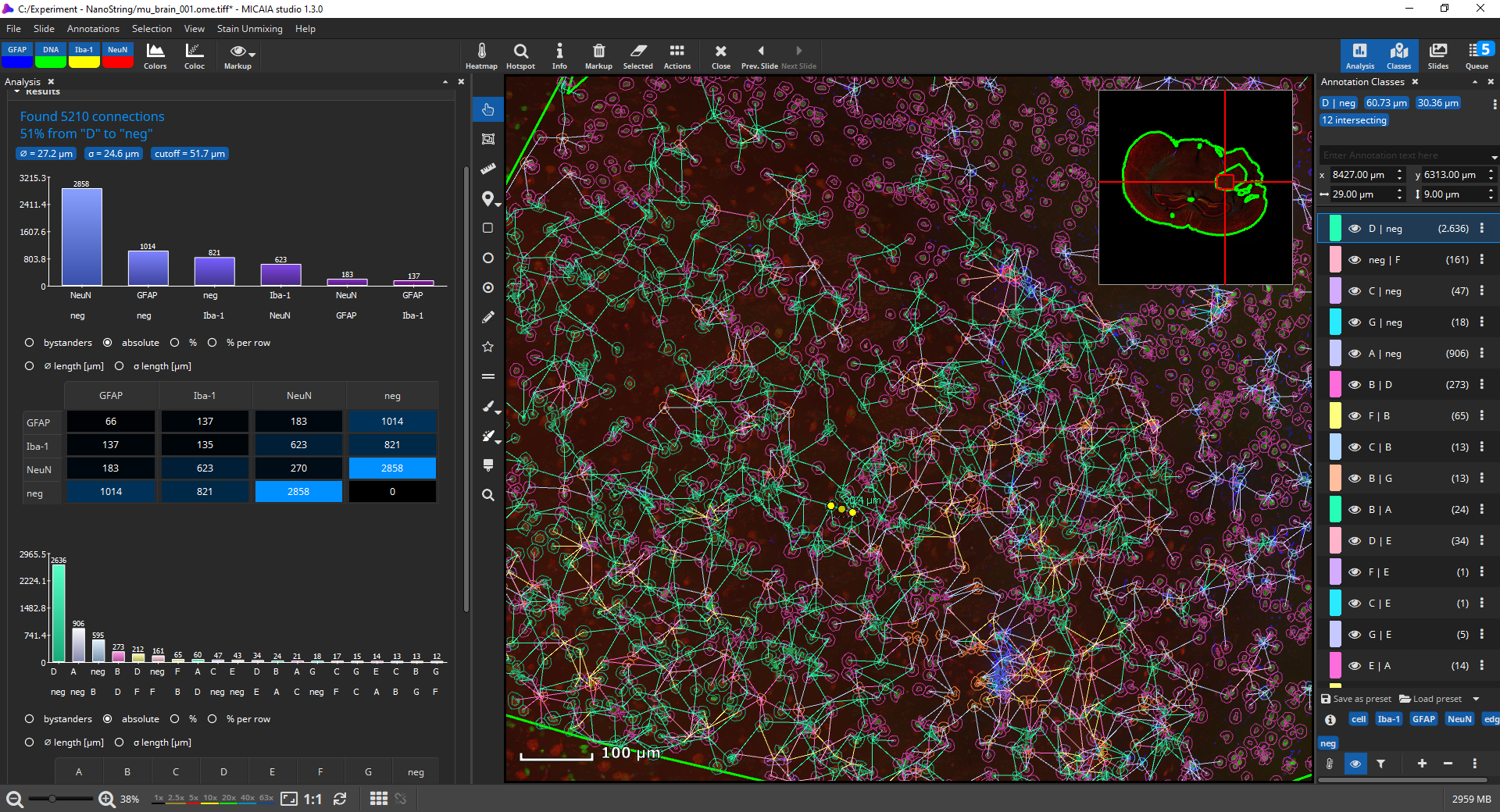
By default, connections between cells of the same phenotype will not be created, though this behavior can be changed. Optionally, long connections can also be omitted, either based on the standard deviation (default: edges with length outside of the 1σ interval are omitted) or by defining an absolute threshold in µm.
Bar charts display, which connections occur most frequently, both between markers and marker-combinations. The tables contain additional statistics such as the average distance (in µm) between cell types or a bystander analysis (“on average, a cell of type A contains 2.3 neighbors of type B”).
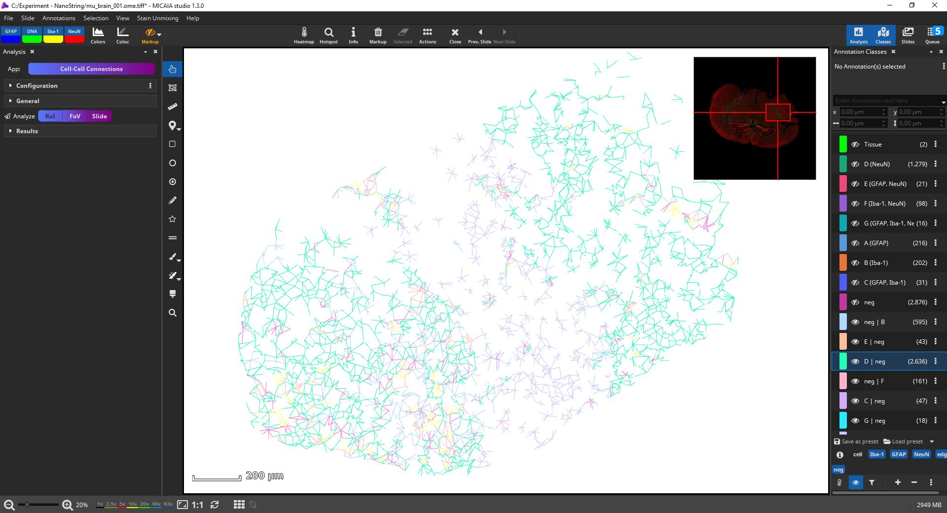
You can again change the appearance, e.g., in the below screenshot. All cell annotations are hidden by clicking the “cell” class tag, the image is hidden (via toolbar, markup, “hide image”), and the viewer background color is changed to white. You may want to include a screenshot in your publication or study report. This can be done simply using the Windows Snipping Tool or, if a higher DPI is required, by using the “File|Save As” option which will show a dialog where you can select to export the current FoV, burn in annotations, and choose a DPI resolution.
Exporting annotations and quantitative results
Each of the above apps allows exporting the markup into GeoJson or Aperio XML, which can be opened by QuPath or Leica ImageScope. Additionally, they support exporting quantitative results to CSV. E.g., the Cell Segmentation App will create one row per cell and include metrics such as the location, area, compactness, elongation, or mean intensity.


Add comment