

After cells or tissue regions have been identified with any of the various apps available in MIKAIA®, it is oftentime of interest to analyze their spatial distribution. The Grid Analysis App offers valuable insights on spatial heterogeneity or histological growth patterns.
- Are cells evenly spread out accross the tissue or do they cluster in specific places?
- Does tumor slowly replace the surrounding stroma by pushing it away or does it infiltrate the stroma and show heavy budding?
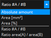
Such questions can be quantified by using the Grid Analysis App. The Grid Analysis App overlays a regular grid on top of the tissue area (or user-selected subregion). The tile size can be specified. For each tile, a metric is then computed. Available metrics are:
- measurements on a single set of classes:
- Absolute amount
Example: count number of tumor cells in each tile - Area [mm²]
Example: tumor area in each tile. - Area [%]
Example: percentage of tumor area from entire tisssue (foreground) area in each tile
- Absolute amount
- measurements for investigating relations between
- Ratio #A / #B
Example: ratio of tumor to immune cells in each tile - Ratio area(A) / area(B)
Example: ratio of tumor to inflamed area in each tile
- Ratio #A / #B
Tumor growth pattern
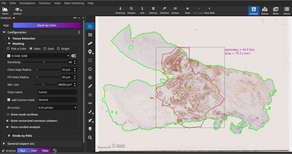
Here, we analyze an IHC tumor marker. The first step is to mask the tumor and stroma areas. We use the Mask by Color App (other app note: MIKAIA®: Quantifying Perineural Invasion in Duplex IHC) and configure it to perform H-DAB unmixing and then threshold the DAB channel. Here, we do not analyze the entire slide, but constrain the analysis to a manually outlined region of interest (pink):
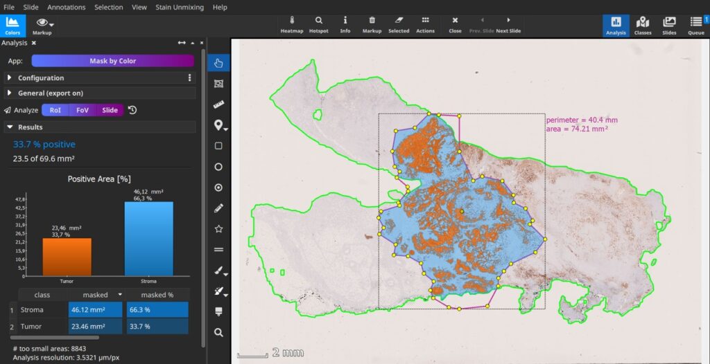
The Mask by Color App generates a tumor mask (orange) as well as a stroma mask (blue).
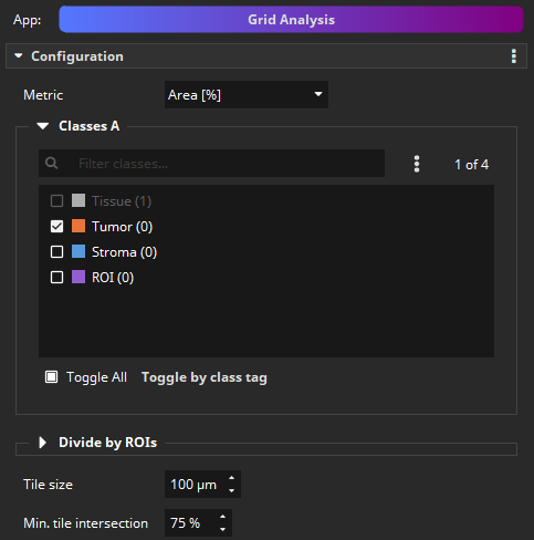
Grid Analysis App
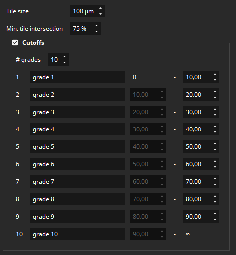
Next, we select the Grid Analysis App from the App Center and configure it. We select the metric “Area [%]” and select our “Tumor” class. We use a tile size of 100×100 µm and set up 10 grades.
The analysis only takes a few second. Tiles are added to the scene as individual rectangles and assigned to the class based on their grade. The class colors are based on a heatmap (blue for lower grades to red for higher grades).
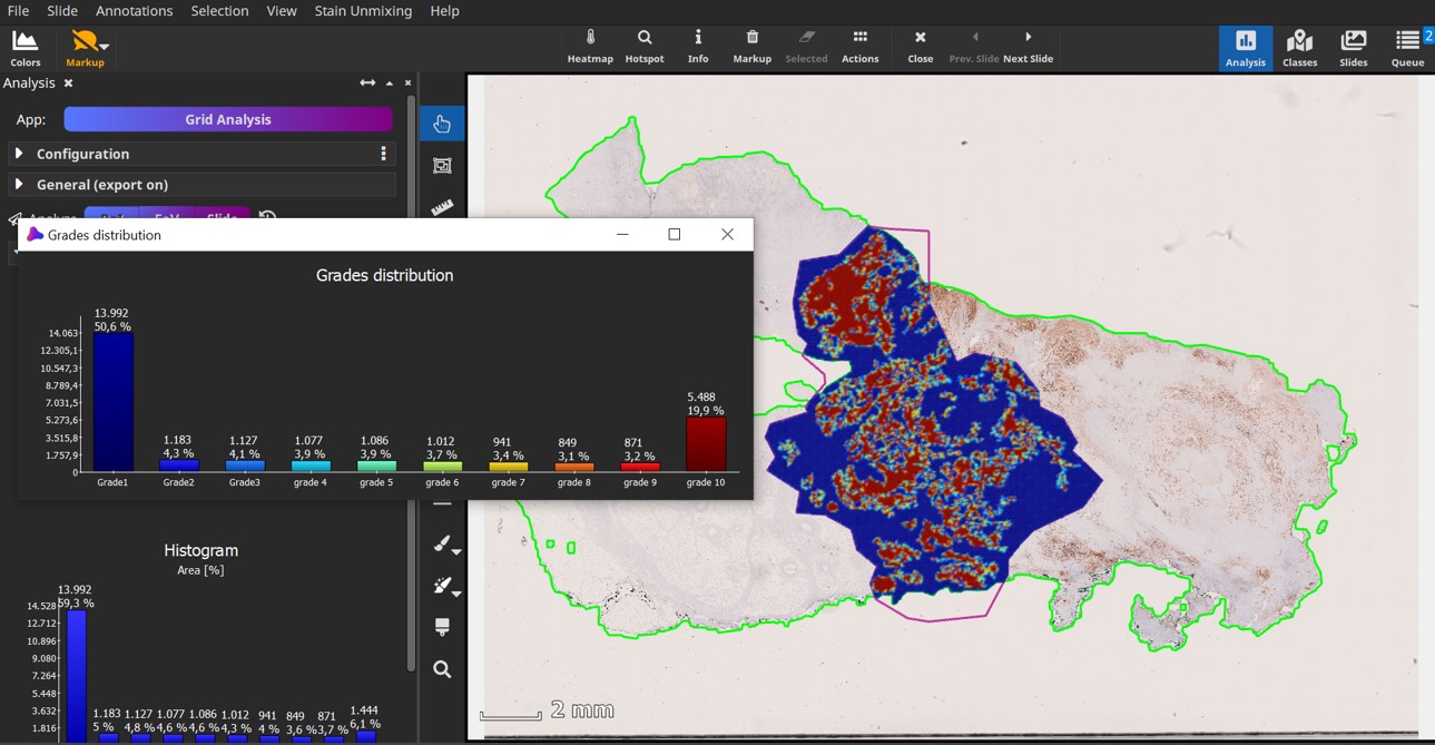
A histogram of the tiles is automatically computed using 10 bins. All values, including the histogram, are exportable to a CSV spreadsheet, which also contains the individual metric values per tile. It can be seen that tumors with a pushing border have either tiles with close to 100% tumor or close to 0% tumor, while infiltrating tumors have many tiles that contain both tumor and stroma.


Add comment